Add Menu
The Add Menu lets you add new elements to the circuit. You can access the edit actions by clicking on the Add button in the main tool bar.
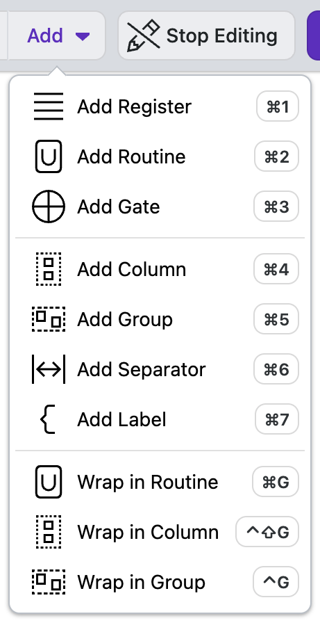

Add Register
The Add Register action allows you to add a quantum Register element to your circuit. Registers are used to represent one or more qubits that are grouped together.
New Register: Select "Add Register" from the Add Menu,
Register Properties You can edit the properties in the Properties Tab on the right hand side of the screen.
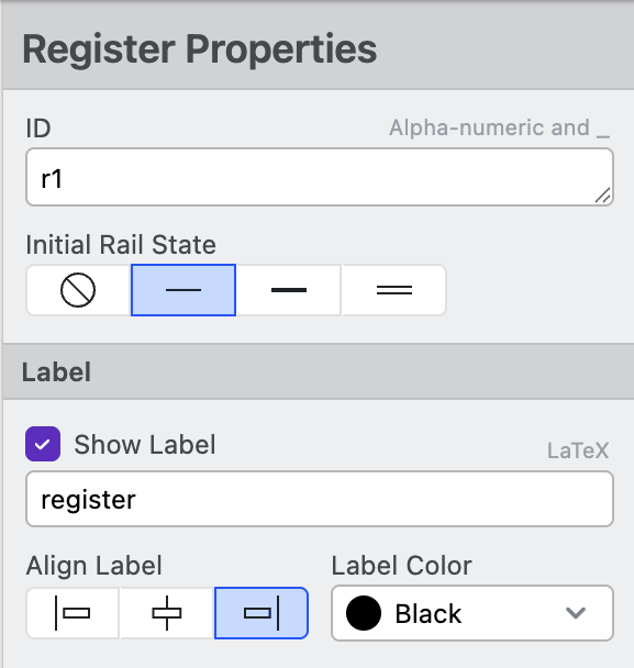
- ID: Unique identifier for referencing specific Registers in the circuit.
Use default ID's when possible
It is easier to update a diagram by clicking, dragging, and nudging than by using register IDs.
-
Initial State: Determine the default state for all Rails. They can be:
- Free: rails will have no appearance until the next circuit element changes the rail state.
- Allocated: Rails will start as a default thin grey line.
- In Use: Rails will start as a bold black line.
- Classical: Rails will start as a double line.
-
Show Label: Checkbox to select if a label will be shown. The field below determines what text will appear on the circuit. The text is rendered in LaTeX (e.g., \ket{0})
- Align Label Determines how the label aligns with other labels (Left, Center, or Right)
- Label Color: Select the color of the labels
-
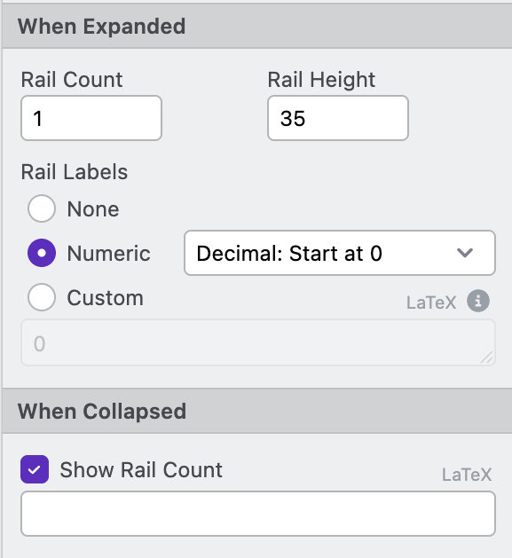
Rail Count: Specifies the number of rails (qubits) in a Register. Registers with more than one rail can be expanded and collapsed.
-
Show curly next to register label: Checkbox to select if a curly bracket appears between label and rail labels
-
Rail Height: Vertical spacing between adjacent rails(qubits) in the diagram.
-
Rail Labels: Toggles the name of rails to one of five settings:
- None: Hide the rail label.
- Hex Mask: Label the rail with hexadecimal mask notation
- Decimal: 0 Based: Automatically label the rail, starting at 0
- Decimal: 1 Based: Automatically label the rail, starting at 1
- Custom: Set the name of each rail in the dropdown that appears below.
-
Show Rail Count: Checkbox to select if the register shows the number of rails in the register when collapsed. When checked, the display text can be set in the field below. Defaults to a count of the number of rails.
-
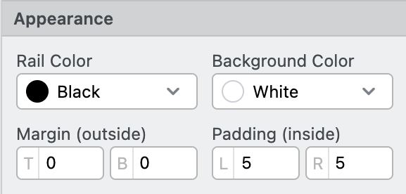
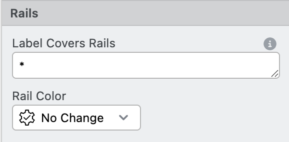
Rail Color: Set the color of all rails
-
Background Color: Set the color behind the register
-
Margin: Space outside of the circuit element.
-
Padding: Space around the element.
Add Routine
The Add Routine option lets you add a Routine element to the circuit. Routine objects can hold a sequence of operations within them and can be copy and pasted to be reused throughout your design.
Usage: Select "Add Routine" from the Add Menu and drag it to the location you want. You can define it's Target and Control Registers properties to determine its registers.
Once you create a Routine, you can adjust its properties in the Properties Tab:
-
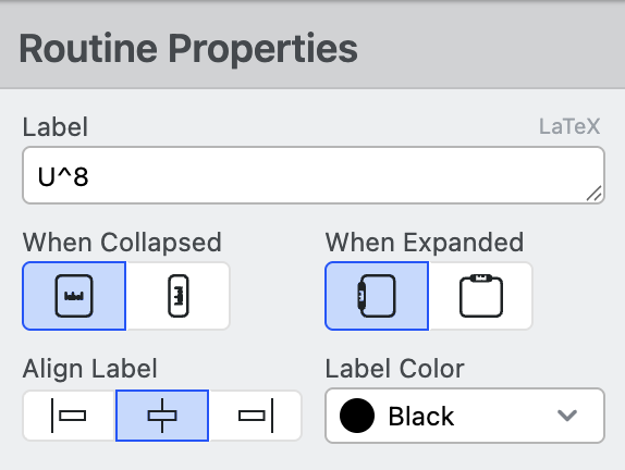
Label: Text that will appear on the circuit. The text is rendered in LaTeX (e.g., \text{USP})
-
When Collapsed: Determine the orientation of the label when the register is collapsed (Horizontal or Vertical)
-
When Expanded: Determine the location of the label when the register is expanded (On Left or Above)
-
Align Label: Determine how the register label is aligned relative to other rails (Left, Center, or Right)
-
Label Color: Set the color of the label
-
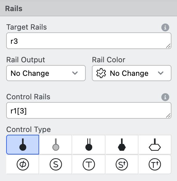
Target Rails: Specifies the
RegistersandRailswhich this element covers.- See Addressing Rails for tips on working with this field.
-
Rail Output: Determine the appearance of the rail after the routine
- No Change: Continue the rail style from previous elements
- Free: Rails will have no appearance until the next circuit element changes the Rail state.
- Allocated: Rails will start thin grey line (default).
- In Use: Rails will start with a bold black line.
- Classical: Rails will start with a double line.
- Gap: Continue current rail style, but add a small gap around the register
- Register Default: Use the default of the register
-
Rail Color: Set the color of the rail within and after the Routine.
-
Control Rails: Defines the
RegistersandRailsthat control this element.- Prefix register/rail names with
~or!to add a not to the control, e.g.~aor!a. - See Addressing Rails for tips on working with this field.
- Prefix register/rail names with
-
Control Type: Sets the specific type of control (e.g., Dot, Hexagon, Multiplexor)
-
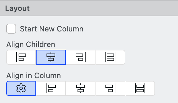
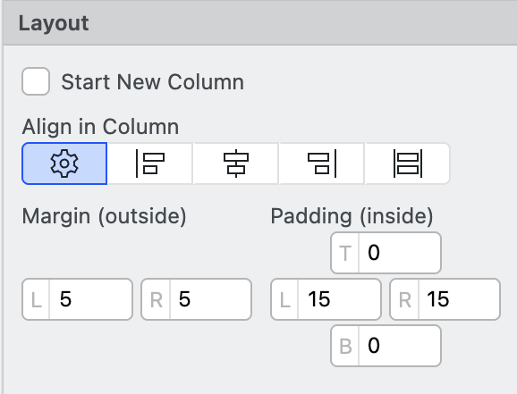
Start New Column: Forces the circuit element to be in a new column
-
Align Children: Set how the circuit element's children will align with other elements within the routine (Auto, Left, Center, Right, and Stretch).
-
Align in Column: Set how the circuit element will align with other elements in the column (Auto, Left, Center, Right,, and Stretch).
-
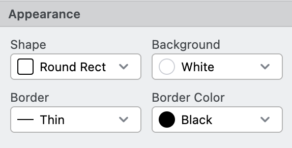
Shape: Set the shape of the routine (None, Rectangle, Round Rectangle, Hexagon).
-
Background: Set the background color of the routine
-
Border: Set the line border thickness of the routine (None, Thin, Medium, Thick, Dotted, or Dashed)
-
Border Color: Set the border color of the routine
Add Gate
The Add Gate option provides access to various quantum logic gates (X, CNOT, SWAP etc.) that can be added to your circuit.
Usage: Select "Add Gate" from the Add Menu and place it on your circuit.
Once you create a Gate, you can adjust its properties in the Properties Tab:
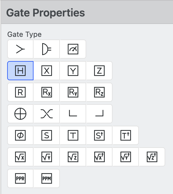
- Gate Type: Choose the type of quantum gate (X, CNOT, SWAP etc.) from this selection.
-
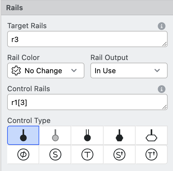
Target Rails: Specifies the
RegistersandRailswhich this element covers.- See Addressing Rails for tips on working with this field.
-
Rail Output: Determine the appearance of the rail after the routine
- No Change: Continue the rail style from previous elements
- Free: Rails will have no appearance until the next circuit element changes the rail state.
- Allocated: Rails will start thin grey line (default).
- In Use: Rails will start with a bold black line.
- Classical: Rails will start with a double line.
- Gap: Continue current rail style, but add a small gap around the register
- Register Default: Use the default of the register
-
Rail Color: Set the color of the rail within and after the gate.
-
Control Rails: Defines the
RegistersandRailsthat control this element.- Prefix register/rail names with
~or!for a "falsy" control, e.g.~aor!a. - See Addressing Railsfor tips on working with this field.
- Prefix register/rail names with
-
Control Type: Sets what specific type of control (e.g., Dot, Hexagon, Multiplexer, etc.)
-
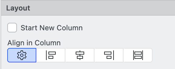
Start New Column: Forces the circuit element to be in a new column
-
Align in Column: Set how the circuit element will align with other elements in the column (Auto, Left, Center, Right, and Stretch).
-
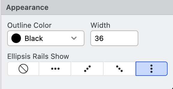
Color: Set the color of the gate
-
Width Set the width of the gate
-
Ellipsis rails show: Set what the circuit displays when a rail the gate is on is labeled as an ellipsis
.... Options are Nothing, Horizontal Dots, Vertical Dots, Upward Dots, and Downward Dots.
Add Column
Column elements allow you to overlap Routine or Gate elements in a single vertical column. Columns are used to force elements to overlap. By default, Circuit Designer adds all elements into implicit columns. You can override this for all circuit elements with the Start New Column checkbox.
Usage: Select "Add Column" from the Add Menu then drag the column to the desired position.
Once you create a Column, you can adjust its properties in the Properties Tab:
-
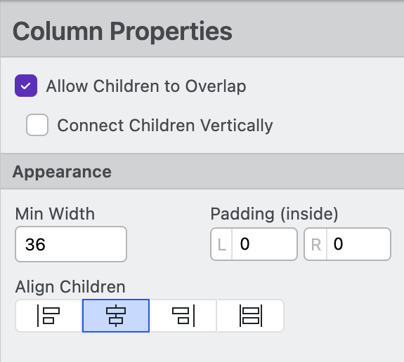
Allow Children to Overlap: This checkbox lets you decide if elements within a column will overlap. This enables a powerful level of flexibility, but it can cause circuit elements to be hidden from view.
-
Connect Children Vertically: Draw a vertical line between all elements within the column
-
Min Width Set the width of the column
-
Margin: Space inside of the circuit element (left and right).
-
Align Children: Set how the elements within a Column are aligned (Left, Center, Right, or Stretch)
Add Group
The Add Group option allows you to create a container or grouping element to organize related elements within your circuit.
Unlike Routines, which imply a code function or subroutine, Groups are purely for annotation or organizational structure within a circuit. Note that Groups can't be expanded or collapsed, and that they cannot be "controlled".
Usage: Select "Add Group" from the Add Menu, then click and drag circuit elements into the group to organize different elements..
Once you create a Group, you can adjust its properties in the Properties Tab:
-
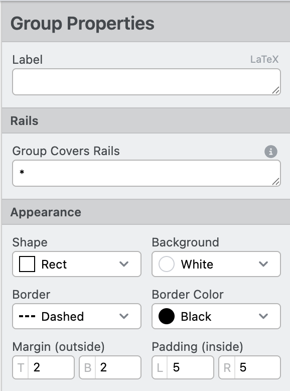
Label: Text that will appear over the group; the text is rendered in LaTeX (e.g.,
\text{USP}) -
Group Covers Rails Specifies the
RegistersandRailswhich the group covers.- See Addressing Rails for tips on working with this field.
-
Shape: Set the shape of the group (none, rectangle, round rect, hexagon).
-
Background: Set the background color of the group
-
Border: Set the line border thickness of the group (none, thin, medium, thick, dotted, or dashed)
-
Border Color: Set the border color of the group
-
Margin: Space outside of the circuit element.
-
Padding: Space around the element.
Add Separator
The Add Separator action adds separator annotation to the circuit diagram.
Usage: Select "Add Separator" from the Add Menu then drag the separator to the desired position.
Once you create a separator, you can adjust its properties in the Properties Tab:
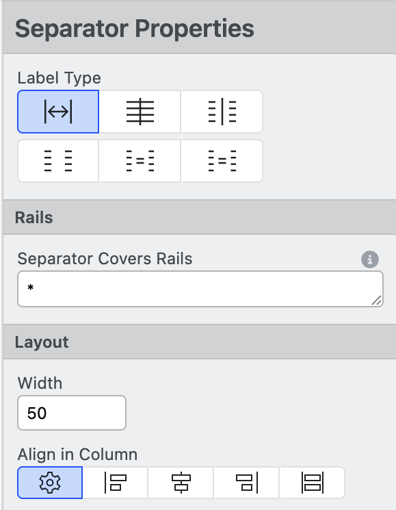
- Type: Set the type of separator
- Spacer: Adds space between circuit elements. Rail lines are still drawn
- Vertical Line: Adds a vertical line to the diagram. Enables the
Line StyleandColoroptions - Equals: Adds an equals sign
=to the circuit - Ellipsis: Adds an ellipsis
...to the circuit - Gap: Adds white space to the diagram. Continues the most recent rail type after the gap
- Gap Reset: Adds white space to the diagram. Resets the rail type to the default value
-
Separator Covers Rails Specifies the
RegistersandRailswhich the Separator covers.- See Addressing Rails for tips on working with this field.
-
Width Set the width of the separator
-
Align in Column: Set how the circuit element will align with other elements in the column (Auto, Left, Center, Right, and Stretch).
Add Label
The Add Label action adds a label annotation to the circuit diagram.

Usage: Click on the circuit element on the canvas you want the label to appear after, then Click "Add Label" from the Add Menu.
Once you create a Label, you can adjust its properties in the Properties Tab:
-
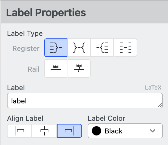
Label Type: Set the type of Label
- Register: Annotate multiple rails together. Register labels cover the rail line. Select between No Curly, Curly on Left, Both Curlies, and Curly on Right to choose the annotaion style.
- Rail: Annotate individual rails over the line. Select between No Slash and With Slash to choose annotation style.
-
Label: Set the text that will appear on the circuit, the text is rendered in LaTeX (e.g.,
\ket{0}). -
Align Label: Determine how the register label is aligned relative to other rails (Start, Middle, or End)
-
Label Color: Set the color of the label text and curly brace
-
Target Rails: Specifies the
RegistersandRailswhich this element covers.- See Addressing Rails for tips on working with this field.
-
Rail Color: Set the color of all rails
-
Start New Column: Force the label to start its own column. All subsequent, non-overlapping circuit elements are added to the new column.
-
Align in Column: Set how the circuit element will align with other elements in the column (Auto, Start, Middle, End, and Stretch).
-
Margin: Space outside of the circuit element.
-
Padding: Space around the element.
Wrap in Routine, Column, or Group
Add a Routine, Column, or Group around all currently selected elements. This is useful for quickly organizing circuit elements.
Learn More
- Return to Getting Started
- Learn helpful tips in the Reference section
- Read about the Frequently Asked Questions